Most brands run ads. A few build systems.Grüns falls firmly in the second category.
Instead of routing traffic to a handful of generic pages, they built a sprawling web of 40+ highly specific landing pages across domains including Grüns, Walmart, and Immun.co. Each page speaks to a different mindset, a different problem, a different identity.
Using data from Spreshapp's Ad Spy, I broke down their most active landing pages by ad count. It's like a small masterclass in message-market matching at scale.
1. Olipop Collab: Borrowed Trust and Emotional Framing
Page: gruns.co/pages/first-order-olipop
Landing Page H1 "Two Gut Health Icons. One Perfect Collab."
Men taking glp-3’s and how gruns help with recovering vitamins since glp’s reduce weight. Women speak from the flavor angle about strawberry vanilla and the word “Relationship” is thrown around a lot, in the context of relationship with the new gruns flavor.
2. GLP-1: Turning a Cultural Trend Into a Conversion Engine
Page: gruns.co/pages/nutrition-support
Landing Page H1 "7 benefits GLP-1 users love about Grüns (besides the poops)"
Their top 5 and top 8th most impression ads is for this landing page.
Top ads for this page talks about how gruns help with vitamins per calories since glp-1s reduce weight and deplete vitamins. There is a lot of mention about how gruns helps with poop’s. People are on calorie defecit so gruns helps with vitamins.
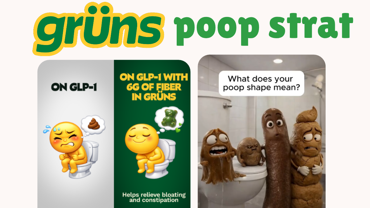
3. Gut Health: Bold Creativity That Shouldn't Work but Does
Page: gruns.co/pages/first-order-gut-health
Landing Page H1 "6 Reasons Why Grüns Is Your Gut's New Bestie"
This campaign steps back from GLP-1 and targets universal gut struggles, with women as the primary audience.
It has the top 1, 3 & 4th ad impressions for the entire gruns meta ads campaign. It has an ai claymation ad about poop texture, which is wild!!! Its mostly awareness about poop texture. This time GLP-1s are less mentioned
Top-of-funnel awareness, done right.
4. The Benefits Page: A Broad Net for Cheap Traffic
Page: gruns.co/pages/first-order-benefits
Landing Page H1 "6 Reasons Everyone's Obsessed with Grüns (and feeling their best)"
This is the most conventional piece of their strategy, and deliberately so.
No niche persona. No specific health trend. Just:
- "20+ vitamins"
- "Fraction of the price"
- General wellness outcomes
Think of it as the wide opening of the funnel. It catches cheaper, broader traffic and feeds it into retargeting pools where more targeted creative can do the heavy lifting.
5. First Order: Controversy Hooks, Straightforward Conversion
Page: gruns.co/pages/first-order
Landing Page H1 "You Have Nutrition Gaps. Grüns Fills Them."
An interesting split shows up here: video dominates ad volume, but image ads drive the most impressions. Worth noting if you're running similar funnels.
Creative angles include a "MTHFR gene mutation" hook and aggressive lines like "f*ck you, hair loss" that grab attention fast.
Beyond those hooks, the page itself is fairly conventional. It functions more as a catch-all conversion page than a deeply segmented funnel. The creative does the targeting work; the page handles the close.
6. Destigmatize the Gummy: Changing the Category, Not Just the Product
Page: gruns.co/pages/destigmatize-the-gummy
Landing Page H1 "5 Reasons Why Millions Are Ditching Green Powders for Grüns"
This one is genuinely clever.
The creative format: a woman explaining to her skeptical partner that these aren't childish gummies, they're real nutrition.
The reframe is subtle but effective. Instead of competing on ingredients or price, Grüns redefines the category itself.
- From candy to functional health product
- From embarrassment to confidence
This is category-creation thinking applied at the ad level, not just in brand strategy.
7. Men and Hair Loss: Where Things Get Deliberately Scrappy
Page: gruns.co/pages/nutrition-support-men
Landing Page H1 "6 Reasons Why Grüns Is Your Gut's New Bestie" (same headline,
different execution)
Target: men on GLP-1 dealing with hair loss anxiety.
Creative formats: notes app screenshots, meme-style images, deliberately rough design.
These ads feel native to the feed. They don't look like ads, so they perform like content. Their top ad in this segment has been running for 50+ days, which in Meta ad terms is a strong signal of sustained performance.
The Bigger Picture: What Grüns Is Actually Building
Zoom out and the pattern becomes obvious. Grüns is running parallel narratives.
Each landing page is its own mini-universe:
- GLP-1 users worried about nutrient depletion
- Women dealing with gut issues
- Men anxious about hair loss
- Skeptics who think gummies are childish
Instead of forcing one message to work across all of them, Grüns builds a page for each belief, matches ads to that belief, and scales what converts.
It's like a constellation of funnels.
The Takeaway
Most brands spend their energy finding the winning ad.
Grüns built a system where multiple angles win simultaneously, each audience feels directly understood, and creative mirrors the customer's internal dialogue back at them.
That's how you build ad infrastructure powerful enough to support a billion-dollar exit.
Data pulled from Spreshapp's Ad Spy feature.